
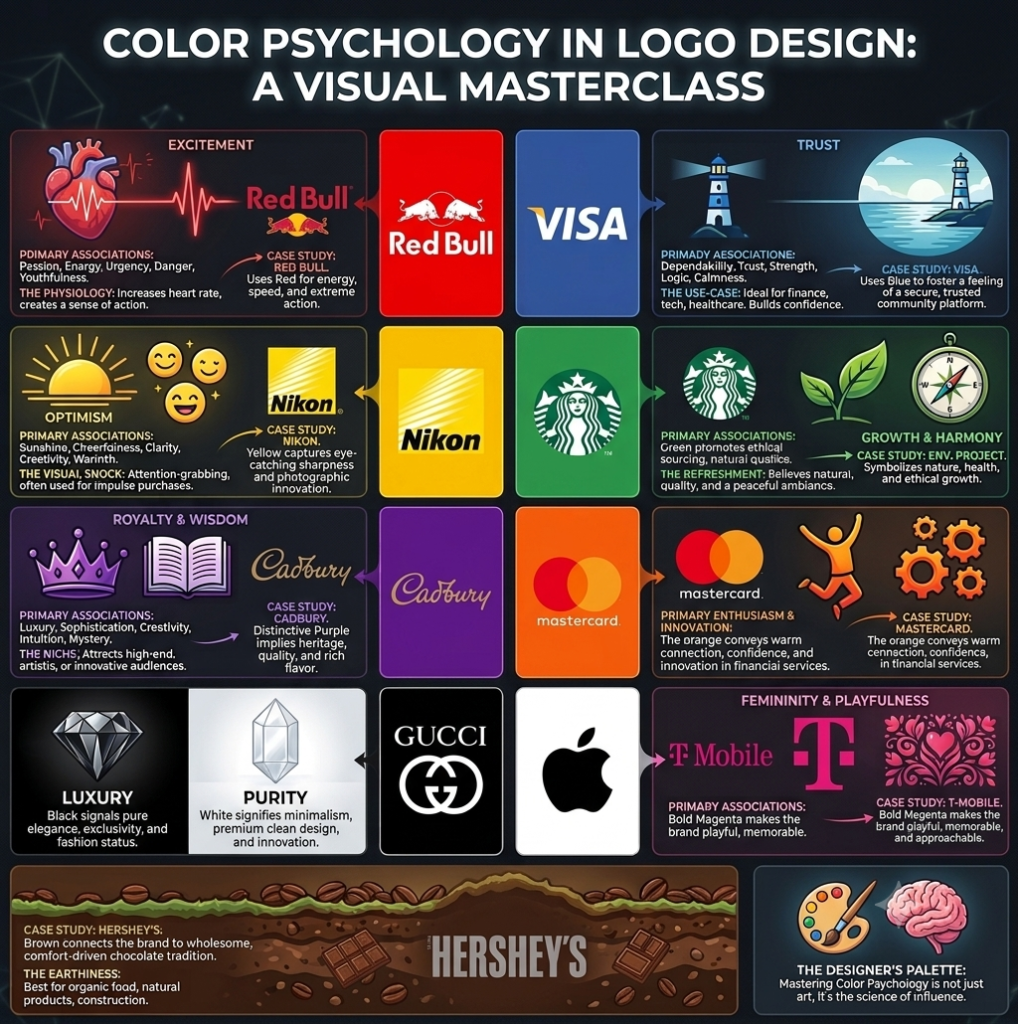
This isn’t an accident. It’s the result of Color Psychology, a powerful tool that graphic designers and marketers use to talk to your brain without using a single word.
If you are a student starting your design journey or a business owner trying to build a brand, understanding how colors work isn’t just a “plus”—it’s an absolute requirement. Let’s break down the fundamentals of color psychology in logo design using real-world examples you see every day.
- Red: The Ultimate Attention Grabber
The Vibe: Excitement, passion, urgency, energy, and youthfulness.
The Science: Physically, red actually raises your heart rate and creates a sense of immediacy. It demands to be looked at.
Real-World Examples:
Netflix: Uses a bold red to convey the thrill and excitement of instant entertainment.
Red Bull: Perfectly channels red to symbolize high energy, speed, and extreme action.
- Blue: The Universal Anchor of Trust
The Vibe: Dependability, strength, logic, calmness, and security.
The Science: Blue is the most globally liked color. It lowers our pulse rate and creates a peaceful, secure feeling. This is why corporate giants love it.
Real-World Examples:
Facebook: Fosters a feeling of a secure, trusted community platform where people share personal lives.
Visa: Uses blue to make you feel completely safe and confident when handling your hard-earned money.
- Yellow: A Splash of Sunshine
The Vibe: Optimism, cheerfulness, clarity, and warmth.
The Science: Yellow is the first color the human eye notices. It’s highly visible, making it amazing for catching the eye of impulse buyers or people driving past at high speeds.
Real-World Examples:
McDonald’s: The golden arches stand out from miles away, promising affordable happiness (and hot french fries!).
Nikon: Uses yellow to capture eye-catching sharpness and photographic innovation.
- Green: Life, Growth, and Peace
The Vibe: Health, nature, wealth, balance, and ethical growth.
The Science: Green is incredibly easy on the human eye because it relates directly to the natural world. It relieves tension and symbolizes freshness.
Real-World Examples:
Starbucks: The deep green siren logo communicates a relaxed, natural, and welcoming ambiance where you can take a breath.
Environmental & Wellness Projects: Almost always lean on green to represent eco-friendliness and natural products.
- Purple: The Royal Treatment
The Vibe: Royalty, wisdom, luxury, sophistication, and creativity.
The Science: Historically, purple dye was so rare and expensive that only kings and queens could afford it. Today, it still triggers a feeling of mystery, high-end quality, and artistic uniqueness.
Real-World Examples:
Cadbury: The distinctive purple instantly implies rich heritage, premium quality, and a deeply satisfying chocolate flavor.
Yahoo!: Chose purple to appear distinctive, creative, and non-corporate—acting as a fun “portal of knowledge.”
- Orange: The Friendly Neighbor
The Vibe: Fun, friendliness, warmth, innovation, and determination.
The Science: Orange takes the aggression out of red and the bright shock out of yellow, leaving you with a warm, playful, and incredibly approachable color.
Real-World Examples:
SoundCloud & MasterCard: Both utilize orange to build a playful, warm connection, conveying accessibility, community, and financial innovation without feeling cold.
- Black & White: Luxury, Minimalist, and Pure
The Vibe (Black): Authority, elegance, exclusivity, and fashion status.
The Vibe (White/Silver): Cleanliness, simplicity, minimalism, and premium innovation.
The Science: When you strip away color, you are left with pure shape and contrast. It speaks of sophistication and never goes out of style.
Real-World Examples:
Gucci & Adidas: Black signals pure luxury, comfort-driven tradition, and high-fashion status.
Apple: The clean white/silver minimalist aesthetic screams premium design, future thinking, and ease of use.
- Pink & Brown: The Niche Storytellers
Pink Vibe: Femininity, youth, playfulness, and compassion. Bold magentas (like T-Mobile or Stylo) make a brand feel approachable, memorable, and distinctly fun.
Brown Vibe: Grounding, earthiness, wholesomeness, and comfort. Hershey’s and Gloria Jean’s use it beautifully to connect their products to natural roots, organic warmth, and rich, comfort-driven traditions.